 |
|
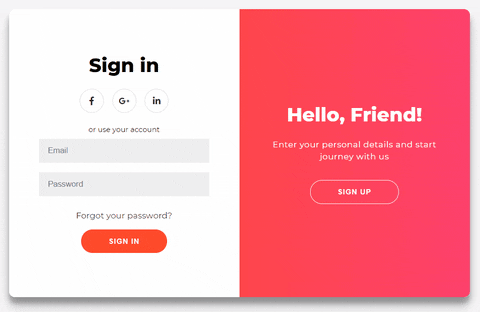
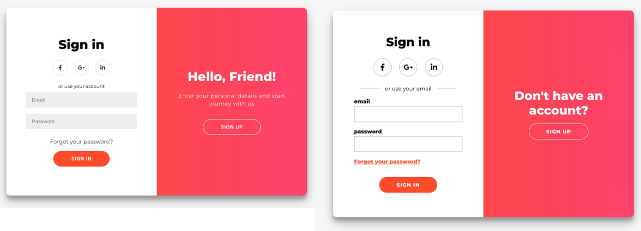
A fellow Dev Florin Pop has made a truly amazing sign in sign up form using a beautiful design from Dribble to put into code. I - like many others - were totally blown away by it. It just looks delightful.
As a practitioner of human-centred, inclusive design and development, however, I’ve started noticing a couple of problems with this interface both from a UX/UI and development perspective.
Let’s get two things quickly out of the way:
-
Yes, aesthetics are important. When 46% of users assess the credibility of a website based on the appeal of the visual design it is indeed essential to look good. But we shouldn’t forget about our own users along the way.
-
Accessibility is not just about screen readers and blind users and maybe not forgetting about proper contrast levels. It is so much more. It’s about properly sized touch targets, thinking about slow internet connections and readability, to name a few… When done right accessibility actually adds a lot to the general usability of your interface.
I cannot recommend Udacity’s (and Google’s) free course on Accessibility enough, to gain a better perspective in the subject.
UI Design Problems
Confusing language / readability
Why would a ‘sing up’ button have the heading: “Hello, Friend!”? Especially confusing as it’s right next to a ‘sign in’ form for existing users, people you might actually call a “friend”, unlike strangers who are just about to sign up to your service.
Yes, the paragraph below the heading kinda explains that you can sign up there (the language is still a bit off) but at the end of the day you are still making your new users work way too much.
It’s better to have abundantly clear headings. People skim read all the time. Also, be more direct with your copy, ambiguous wordings can be very confusing to a lot of users. Remember: the average American adult reads at a 7th to 9th grade level.
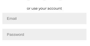
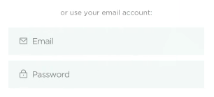
Tiny text and the colour grey
The issue is not just with insufficient contrast but it’s also sending the wrong message to the user: grey = disabled, unimportant; add the small size and it will be easily dismissed by users.
But seriously, those light grey input fields are barely standing out from the white background. And I wish that would be the only problem with them but it isn’t…I won’t get into here, you can see the end of this article for my rant on input field design if you are interested.
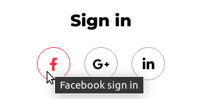
Is that a link?
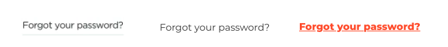
Above you can see the links from the original design to Florins and finally mine. Which one would you say actually looks like a link?
I know mine looks very vanilla, and hey, by all means, go fancy and remove the underline but it needs to look different from regular paragraphs: use colour (but not just colour because colour-blind people also exist), boldness, anything to make it stand out.
Even the original Dribble design is problematic as the underline is miles away from the link and could easily be interpreted as a decorative border… not to mention it’s barely visible. Grey on white again… I’ll spare you from another contrast rant.
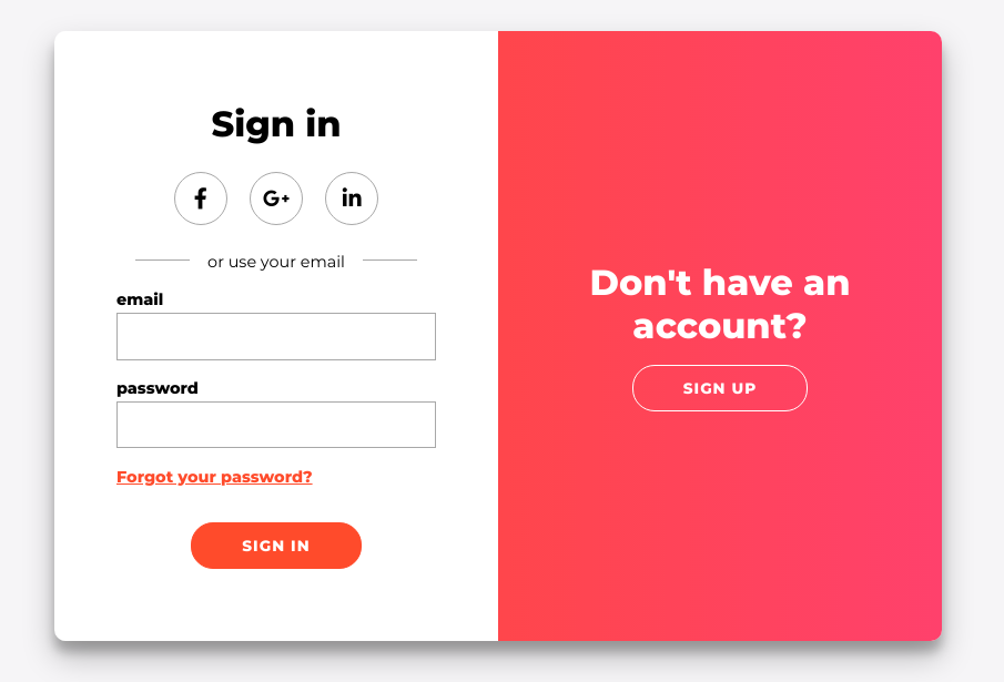
My Design
All that said, here is the design I’ve ended up with:
Just for comparison’s sake:
Code problems
Once the design was ready I’ve moved on to the code. If we look at the amount of code required then accessible development is definitely more complicated.
Lines of code:
Florin’s design: HTML: 47, CSS: 239, JavaScript: 11
Mine: HTML 60, CSS 317, JavaScript: 34
What needed changing?
- Restructuring the DOM
Labelsandarial-labelsfor icon links:hoverstates for links and buttons- Fixing the tab order
- Adding
requiredto fields - Update page
titleaccording to which form is active
Accessibility starts in your DOM tree. The first thing I’ve done was to reorder the HTML so it starts with the sign in form. I’ve also added HTML5 elements (sections) to break up the forms into the two pieces they are: social and email, both with an h1 (some hidden visually and available only for screen readers).
I’ve also labeled all of the social icon links with aria-label, this way when they are in focus the screen reader doesn’t just say link-internal but actually says, for instance: sign up with your Facebook account. On top of this I’ve added a title attribute and :hover states to aid sighted users.
Next step was to fix the tab order. If you don’t make an element display:none users who use a keyboard or other devices to navigate your site can easily stumble on things you ‘don’t want them to see’. This is where the JavaScript blew up a bit 😅. I had to programmatically handle the forms’ visibility along with the tabindex of the buttons on the overlays and then pull the focus on the first element of the form that became active.
This is a common one amongst programmers and I’ve never really understood it: do not remove the :focus ring! I know it’s ugly and it does have it’s own accessibility issues (some browsers don’t change the colour based on the background rendering it invisible) but that’s how some of your users navigate your site because once again: accessibility != stuff for blind people.
Also, required fields should be required. It helps a lot with error handling.
<input id="signInEmail" name="email" type="email" required />
And finally, something I haven’t added to the Codepen code because it’s not allowed but when the nature of the page changes so should the title. You can update the page title easily with JavaScript to reflect the active form.
document.title=”Sign in to service”
A special rant on inputs
Input fields in this UI’s case are the username, email, password fields.
Looking good. But what happens when you start typing?
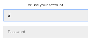
Can you now tell what that field was? Not short of deleting its content. No labels mean a memory strain for your users having to remember what field they are filling in. And sure, you say, “Christina, I’m not stupid, I know I’ve started typing my email address”. Right, so what happens if you take a phonecall whilst filling out the form? Or your cat is doing something adorable that you quickly have to film? And we haven’t even considered that you might get a field wrong; we are human, we make mistakes. With this design pattern you are not giving a chance to your users to re-check the form before sending to make sure they’ve filled it out correctly as the only way to see what that field was is to delete its content…not ideal. You should never rely on best case scenarios in UX.
The original design did call for icons in the field (I’ll assume these icons would stay visible as you type in the field).
That’s okay-ish but still not great as it relies heavily on users’ understanding of these icons. It’s (mostly) fine when it’s an email field or a password one but how do you ask for a house number? Postcode? Icons really only work well and are good for UX when used along with labels.
Also, that grey… Let’s not forget, not everyone is a twenty/thirty-something designer with a well-calibrated fancy monitor and start adding visible borders to fields.
A word on placeholder text. First off, out of the box it’s not accessible as it doesn’t have enough contrast. But! Before you go on copy-pasting the code to fix this issue note that according to the Nielsen and Norman Group placeholders are bad for conversion (and hence UX) as they send the confusing message to users that the field is already filled. (Not to mention some screen readers simply don’t read them at all)
So how does an accessible, human-centred input looks like?
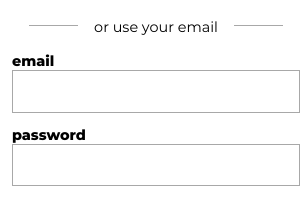
- Label. Label. Label. You can use floating labels like Google if you want to go fancy, but never ditch a label (unless it’s super clear what your field is e.g. a search field). An added bonus is that labels are clickable so you get an even larger touch target.
- It has borders. Four of them! Forget the bottom border only design pattern; there’s a reason Google dropped it from Material: it does not work.
- No placeholder text.
- If you need to add some helper text, do it outside the field, for instance, under the label.
Want to see more of my coding projects?
From scrapers to Chrome extensions, I like to build stuff that solve problems. Check out my front-end projects.