 |
|
IKEA’s website has recently gone through a facelift, and I’ll call it a facelift because it was mostly for beauty and not so much for usability. A quick search on LinkedIn tells me there are 131 people working at IKEA whose title in some way includes UX Designer. There must be a juicy little story there.
There are many things wrong with this new IKEA website so grab your meatballs, FYND a chair, lean back, this will be a long series. As a tiny teaser: for a while there was no colour filter which was especially entertaining whilst looking for kitchen cupboard doors. The METHOD kitchen cupboard system has 1255 results for the word ‘Method låge’ (door). That got fixed, so many other things, however did not.
In this post I’ll tackle my biggest bugbear: the new menu.
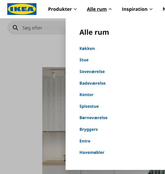
Where are the icons?
For some strange reason the design decision was made to go from using icons and labels to just labels. For comparison’s sake, here is the old design that’s still being used on the Hungarian IKEA site.
You know who - mainly - benefits from icons on IKEA sites? Internationals. Just look at the above screenshot; even if you don’t speak the language you would know where most of those links take you, wouldn’t you?
Let’s get user persona-l
I wonder, is there really no user persona drawn up by the IKEA website UX team that just says:
‘Expat who’s just moved to a completely new country starting a new life == buying a lot of our furniture.’
Migration within the EU* is pretty common and sometimes you do end up in a country where you don’t (yet) speak the language.’ *80% of IKEA’s sales are in Europe
But it’s not just a language thing. For which, btw, it would be nice if you could introduce a simple language picker. Since the IKEA website is available in many countries in many languages it wouldn’t even be a massive deal to translate between languages. Or just have an English one at least:
It could fit nicely next to your unlabeled auxiliary icons
Icons also make good targets for touch and make recognition faster.
Conclusion
Yes, UX research shows that icons are not terribly useful…on their own! Don’t believe me? Let’s see then what a slightly more well-known person in UX has to say about this topic:
“Icon plus label is superior to icon alone or label alone. “ - Don Norman
I do recommend reading Don Norman’s whole essay(from 2015!) where the quote is from. He writes about the issue that is still alive and well in the design community: where we started going towards “pretty looks” all the while destroying ease of use and understanding. He mentiones Apple explicitly and unfortunately many designers see what Apple do and copy them. I personally think it also doesn’t help that most places are now hiring UI/UX Designers instead of a UI Designer and a UX’er. Finding someone who’s good at both is pretty much impossible, therefore teams tend hire whom we used to call Graphic Designers as their portfolios will be much more visually impressive.
Bright side
The navigation is a lot more organised now. For instance, compared to the very busy Hungarian menu the new one has a separate Rooms and Products navigation item (the Hungarian menu says ‘All rooms/products’).
Number of main nav items:
- Old: 10 + 5 secondary
- New: 4
Bug
The fly in the accessibility ointment comes when I use Google Translate to translate the page to English. If you do that the menu’s text links are no longer clickable, only their padding (the few pixel space on their left and right). Fun.