Website
My role
Website and Digital Officer
I have analysed the website, collected user and stakeholder feedback then
made recommendations on changes to be made.
Initial problem
Not enough foster carer sign ups. They always have to be boosted by a digital marketing campaign to create new leads.
Insight/research
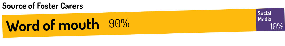
Asked current foster carers how they've found out about fostering for the Mayhew (90% Word of Mouth)
Fostering is a relatively unknown concept for many, with a lot of myths involved (i.e. it does not, in fact, cost you any money: food, toys and vet care is provided by the shelter). These are addressed in social media campaigns or WOM talks.
It's important to seperate two main groups of potential carers:
 The aware user
Knows what fostering is and is currently thinking of fostering.
Based on user research - whilst with some difficulty - all of them could find the Fostering page. Credit to them because it is hard to find. Improving their journey was added to the UX todo list.
The unaware user
Has no clue about fostering but might consider it. They are our main target audience right now.
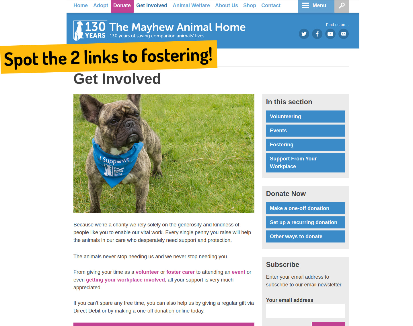
The real problem: The only potential entry point for an unaware user is a banner link.
This link is on the main adoption page that has an average pageview length of 8 seconds. Of course, it is possible that a user would stumble upon fostering whilst looking at volunteering opportunities but those are very low traffic pages with people mostly looking for in shelter placements.
The answer? CTAs? Banner blindness anyone?
We can introduce more informative CTAs that say more than just "Fostering". The only issue with this is that our message is then vulnerable to banner blindness.
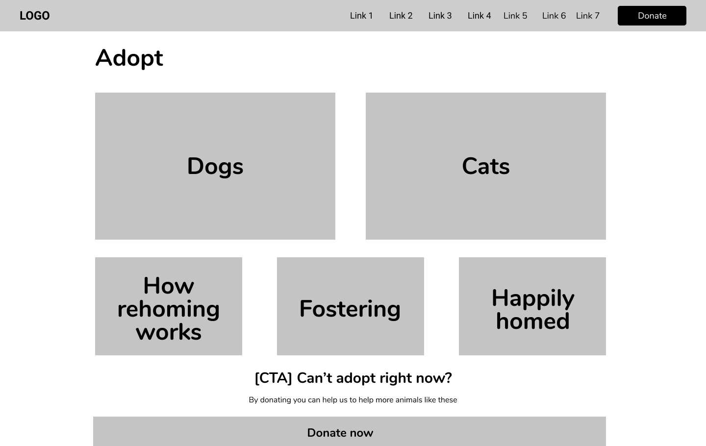
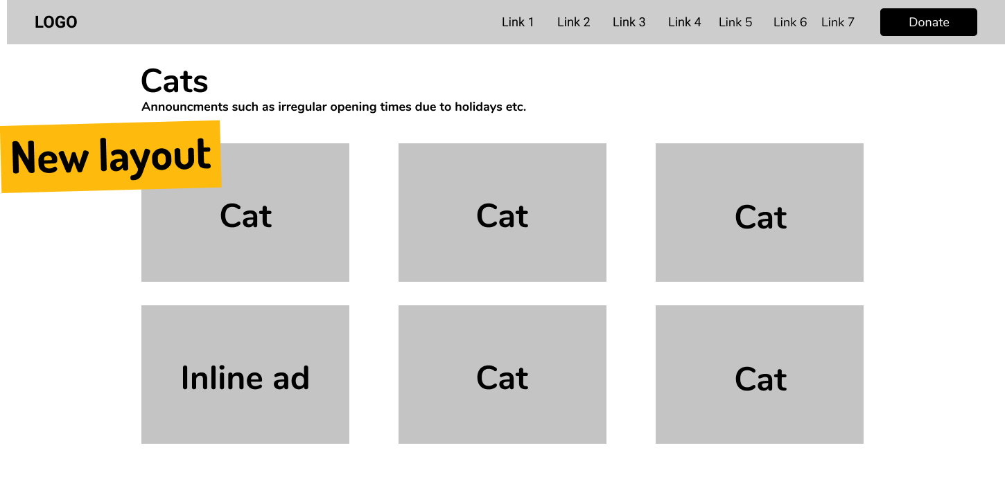
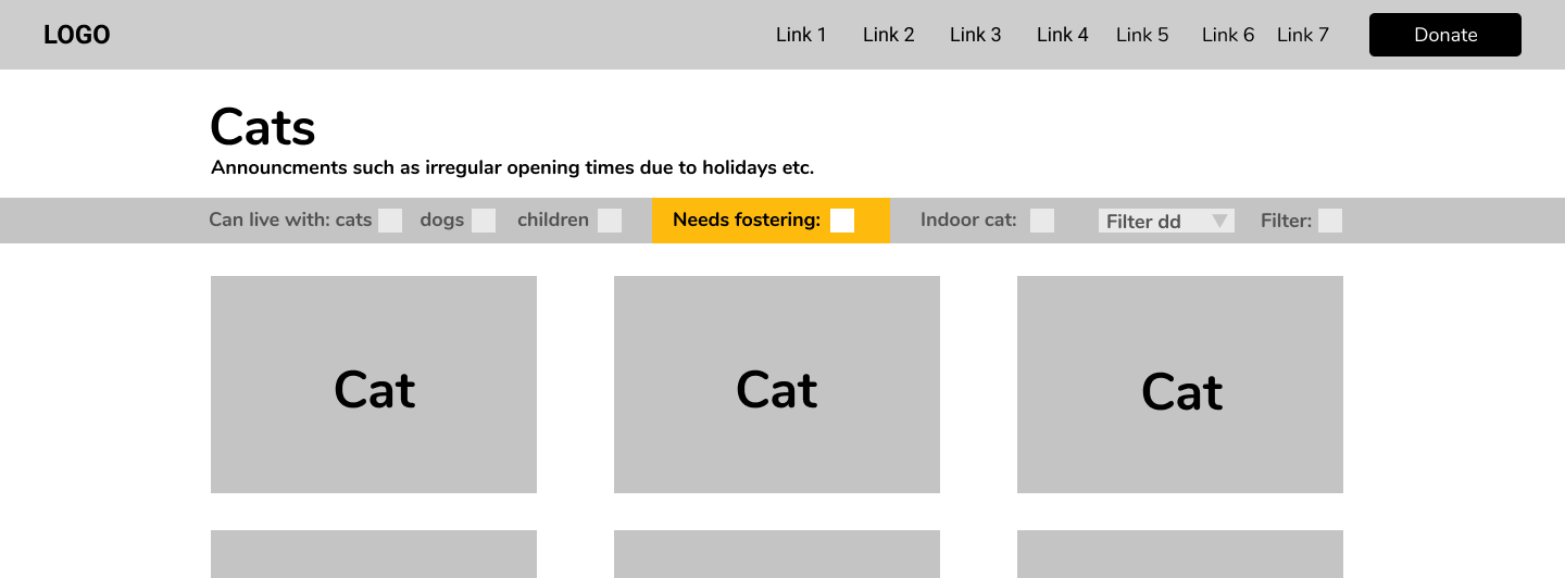
Solution - Time to go native
Having come from advertising I suggested switching to ‘native ads’, these are UI elements that look much like they are part of the content instead of actual advertising.
The listing pages of dogs and cats are the most high-value pages on the website with the highest average amount of time spent on just these two pages.
Additional features to support fostering
With the plans to introduce filters on listing pages I have also added a filter criteria for cats/dogs needing a foster family.
Reusability
This method was proposed to be used for fundraising CTAs as well to utilise the volume of traffic on the listing pages.